WRITTEN BY // JESSICA HEATHCOTE
COLLABORATORS: ALANA CHO, ANDREW SPINKS - INDUSTRIAL DESIGN TEAM
PUBLISHED: NOVEMBER 2025
Colour is one of the fastest-moving elements in spatial design, and this year is shaping up to be a period defined by contrast. At DisplayWise, we’re seeing the 2026 colour trends for exhibition and pop up displays being grounded in warmth with elevated neutrals, and thoughtful injections of luxury.
Your brand palette will always the foundation of your space as consistency builds recognition, trust, and visual recall. However, that doesn’t mean you can’t blend in trend-led tones to keep your display feeling fresh, relevant and visually striking to your target audience.
We’ve rounded up our 6 favourite colour trends for 2026 that will inject a fresh perspective, influence movement, and encourage deep brand connection within your space.
1. Refined Earth Tones: Clays, Ochres & Desert Neutrals
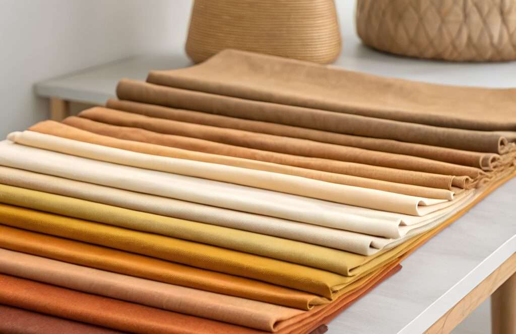
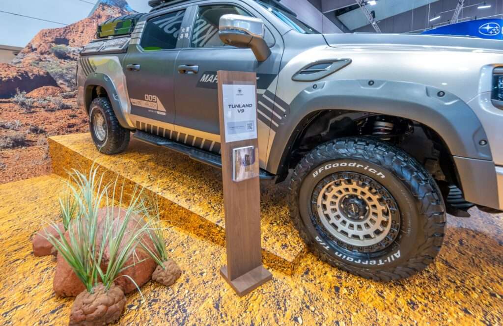
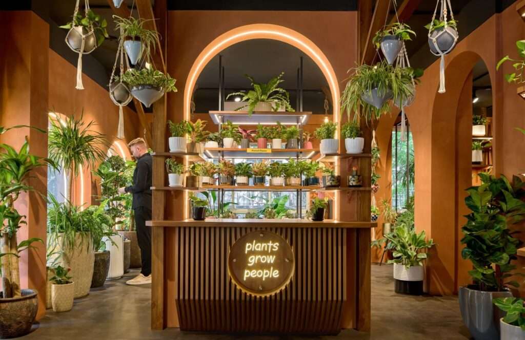
The shift toward nature-derived palettes continues, but 2026 brings a more curated, and elevated interpretation. Think Australian desert hues, warm caramel clays, nuanced terracottas and sandy neutrals as key colour trends for exhibition and pop up displays that feel both contemporary and timeless.
WHY EARTH TONES ARE TRENDING IN 2026
These grounded shades create calm, connected environments, perfect for brands leaning into wellness, luxury or natural storytelling. They also pair effortlessly with popular materials such as timber joinery, textured laminates, soft lighting, or handcrafted elements. Check out our latest blog on 2026 Materials Trends for additional inspiration.
WHAT INDUSTRIES REFINED EARTH TONES WORK BEST
- Beauty and skincare
- Outdoor/Automotive
- Home and lifestyle brands
HOW DISPLAYWISE EMBRACES COLOUR TRENDS
At DisplayWise, we elevate earth tones through premium graphics, custom timber treatments, textured panels and curated lighting schemes, all designed to make your palette feel intentional, and not flat. We also prototype in-house so our clients receive material boards, colour samples, textured swatches and scale mock-ups early in the process. This approach ensures your desired tones and textures translate seamlessly into the built space, evoking emotion and brand connection.
Want to play with more tactile, warm textures in your next display colour palette? Chat with our design team to explore how earthy tones can shape your next custom exhibition stand or pop up in 2026.

2. Citrus Sells
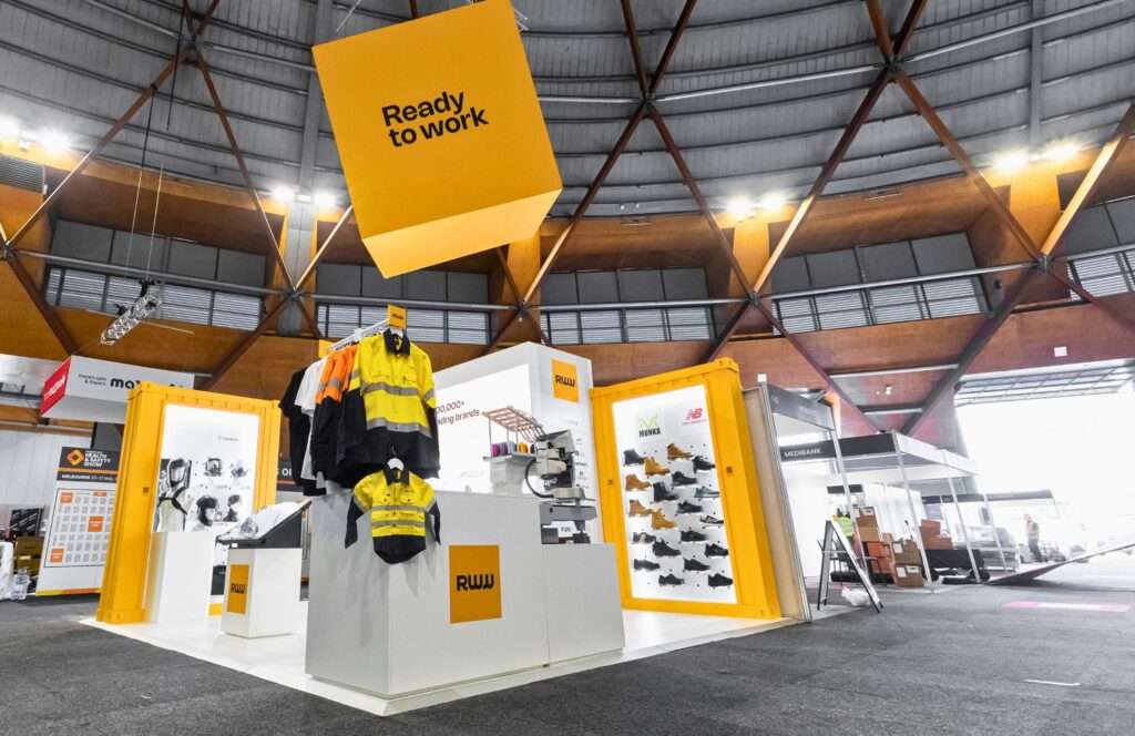
Vibrant citrus tones including lemon, mandarin, and neon lime are back in our 2026 colour trends for exhibition and pop up displays. These vibrant palettes are set to inject energy and immediacy into displays that pack a real brand punch!
WHY CITRUS COLOURS ARE TRENDING IN 2026
In exhibition halls or cluttered retail environments (traditionally dominated by neutrals) citrus hues deliver instant cut-through that stops your audience in their tracks. These vibrant tones can energise your space, heighten brand recall and create directional flow for the high-traffic nature of expos and shopping centres. Plus, they also photograph exceptionally well, which is an advantage for brands chasing strong social amplification and real-time content moments.
WHAT INDUSTRIES CITRUS TONES WORK BEST
- Technology
- FMCG including health & beauty, and food & beverage
- Apparel, PPE and safety brands
HOW DISPLAYWISE EMBRACES COLOUR TRENDS
We amplify citrus tones using high-gloss acrylics, bold vinyl applications, and illuminated signage to ensure maximum vibrancy under exhibition hall or shopping centre lighting. Through our robust supply chain and colour-managed print process, we work closely with our partners to source the perfect brand colours and trend accents, ensuring consistency across paint, graphics, plastics and lighting.
Ready to energise your next activation? Speak with our team about using citrus accents to drive more brand impact in 2026 for your display strategy.
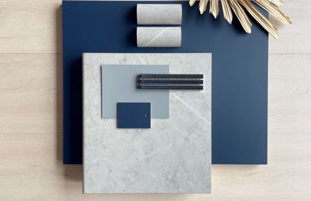
3. Deep Ocean Blues & Inky Teals
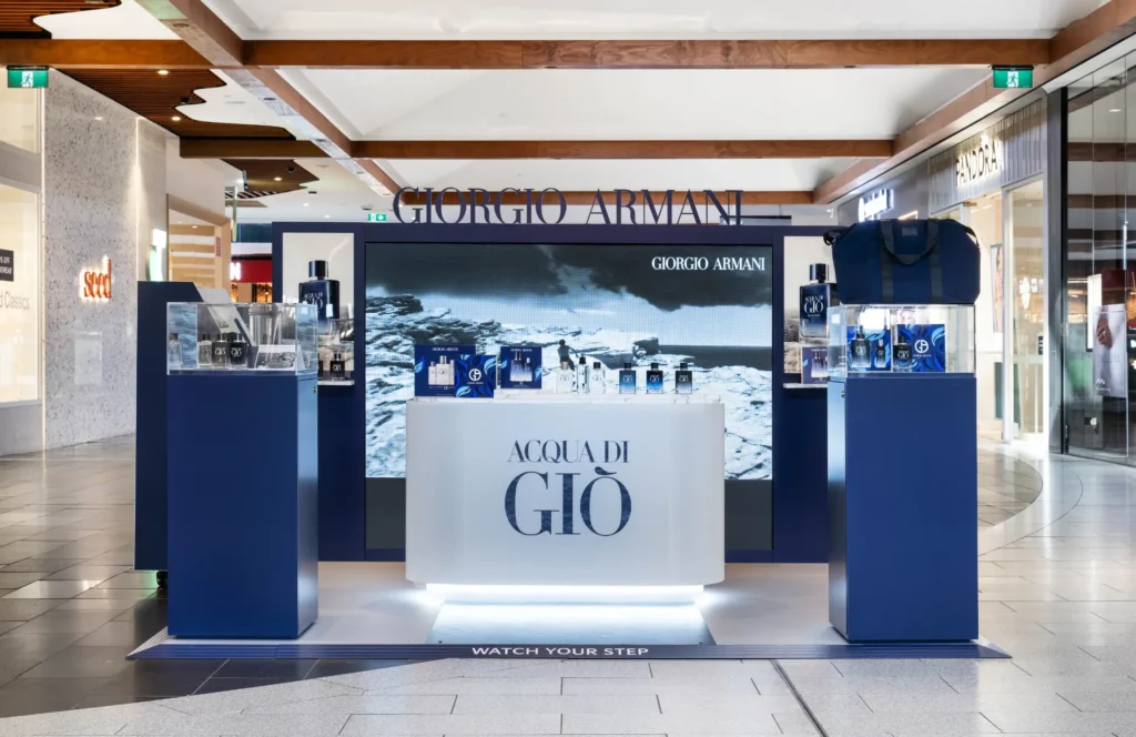
Rich blues are emerging as the new “premium neutral”, offering mood, depth and a sense of confident sophistication for 2026 colour trends in exhibition and pop up displays. These hues tap into biophilic design principles too, reflecting colours found in nature that soothe and stabilise the sensory experience of a space.
WHY OCEAN BLUES & INKY TEALS ARE TRENDING IN 2026
Smarter brands are increasingly choosing palettes that feel trustworthy, modern and immersive. The deep blues and calming teal colour palettes create a sense of emotional stability while still feeling bold enough for competitive environments. They also enhance complementary materials beautifully such as timber, metals, and stone finishes, making them easy to incorporate and compliment your existing brand colours.
WHAT INDUSTRIES OCEAN BLUES & INKY TEALS WORK BEST
- Automotive
- Financial services
- Luxury retail
HOW DISPLAYWISE EMBRACES COLOUR TRENDS
We combine deep blues with metallic accents, matte finishes and architectural lighting to create dimension and sophistication in both custom-built and modular environments. With our test-assemble service, we pre-build elements including graphics, painted finishes and colour-matched panels to ensure your chosen tones align perfectly with your PMS or brand palette. Paint colours and graphic prints can widely vary from digital PMS or Pantone colour values, so early testing is essential to get the perfect result for your brand and our team handles this with precision.
Want a premium, modern palette for your next activation or exhibition stand? Chat with DisplayWise about integrating blues, teals or biophilic design elements into your 2026 display strategy.
Want a quick chat? We guarantee you’ll hear back in less than 60 minutes*

4. Metallic Neutrals: Champagne, Warm Gold & Soft Pewter
Metallics continue to evolve and shift from bold, high-shine statements into soft, refined accents that elevate without overwhelming. In 2026, metallic colour trends for exhibition and pop up displays are expected to embody the tone of “quiet luxury,” blending timeless sophistication with subtle warmth. These tones also enhance any environment and when layered sparingly, metallics act as visual punctuation, guiding the customer journey and amplifying hero brand moments.
WHAT INDUSTRIES METALLIC NEUTRALS WORK BEST
- Fashion & beauty
- Technology (premium product lines)
- Homewares and interiors
HOW DISPLAYWISE EMBRACES COLOUR TRENDS
From metal trims and brushed paints through to pearlescent graphic applications, all metallic detailing is produced in-house for speed, accuracy and consistency. Our graphic and paint studios can also use water-based, low-emission paints if required along with samples provided that align with sustainability frameworks such as Ultra-Low VOC, GREENGUARD Gold and Global GreenTag. This approach delivers premium finishes while supporting the sustainability values many brands now prioritise. Pair this palette with trending materials from our 2026 Materials Trends insights blog, and metallic neutrals can transform your display into a contemporary, luxe experience.
Planning a pop up or exhibition stand in 2026? Chat with our team about using metallic neutrals to elevate your space.
5. Pantone Colour of the Year — Cloud Dancer
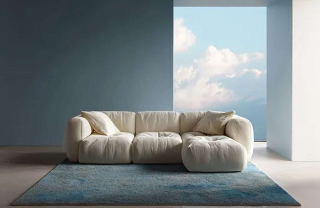
Pantone’s Colour of the Year for 2026, Cloud Dancer, is a soft, ethereal white that balances escapism with calm. It’s versatile, uplifting and pairs seamlessly with timber, pearlescent detailing and soft metallics, making it an ideal accent for design applications in brand experiences and custom exhibition stands. This colour trend for exhibition and pop up displays is the perfect example of using a key structural colour to anchor your space, that builds on your spectrum of brand colours.
HOW DISPLAYWISE EMBRACES COLOUR TRENDS
Whether used in lighting washes, graphic layers, or soft furnishings, Cloud Dancer offers a refreshing way to modernise your palette while retaining clarity and approachability. With a variety of colour stories to help refresh your design approach, this colour trend is equal parts contrast and harmony for 2026.
Love Pantone’s Colour of The Year? Contact DisplayWise to explore how we can create a stand-alone statement or combine it with other hues for your next display.
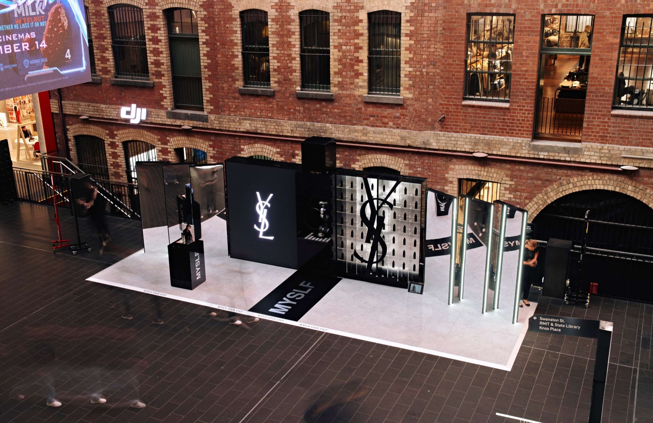
6. Modern Monochrome: High Contrast & Clean Simplicity
Monochrome is making a major resurgence in 2026 with it’s minimalist, modern aesthetic that’s incredibly effective for brands wanting clarity and sophistication. Not to be mistaken with colour blocking, monochrome is essentially one colour, using different variations of shades, tints and tones to create one cohesive look. Though, it’s often mistaken for just using black and white. Colour blocking on the other hand, pairs opposites on the colour wheel like blue/orange to create bold, unique combinations that easily stand out.
WHY MONOCHROME IS TRENDING IN 2026
Monochrome delivers immediate visual order, something highly valuable in busy exhibition halls and pop up environments. It strips away distraction and puts products, storytelling and lighting at the centre, and the 2026 shift is all about texture over tone. Think ribbed surfaces, soft sheens, stone-look laminates and diffused lighting that adds dimension to an otherwise simplified palette.
WHAT INDUSTRIES MONOCHROME WORKS BEST
Education/EdTech
Health/Wellness
Government/Utilities
Pharmaceuticals
HOW DISPLAYWISE EMBRACES COLOUR
In a monochrome palette, there’s nowhere to hide – every join, seam and surface transition is on show. That’s where our 25+ years of custom joinery expertise becomes a real advantage for brands looking to play with this palette. At DisplayWise, we engineer and fabricate with absolute precision, creating seamless edges and concealed fixings that hold up under the closest inspection. That’s why we apply architectural-level detailing, tight quality control procedures, and meticulous finishing across every element.

Ultimately, your brand palette will always anchor your space — it’s what builds recognition and trust. But layering in the right trend-led tones can keep your display feeling fresh, relevant and visually compelling for your audience. Colour is a strategic tool that can be used to influence movement, emotion and brand perception inside a space. Whether you’re planning an exhibition stand, retail pop up or experiential activation, selecting the right palette can significantly increase dwell time and customer engagement.
The DisplayWise team can guide you through colour trends for exhibitions and pop ups, pairing your brand identity with what’s emerging for 2026. Get in touch with us today to start working on your display brief that feels purposeful, modern and built to perform.